
Trend Charts
Seeing the Bigger Picture: Daily metrics can be misleading. When you check numbers every single day, you’re often looking at noise rather than signal. Overreacting to short-term swings can pull you away from priorities that actually move the needle.
Trend charts help you zoom out and stay calm. Instead of chasing every blip
Setup Your Table
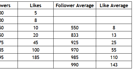
Create three columns; the first contains the dates that you will segment your data. The second and third are for your followers and likes.
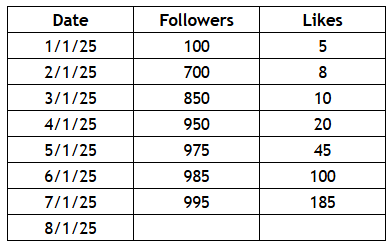
Fill In Your Data
For each date enter the data from that date. While you can look at this table and gain some insights, the lack of a trend makes it hard to quickly see what direction things are moving or if progress is slowing.
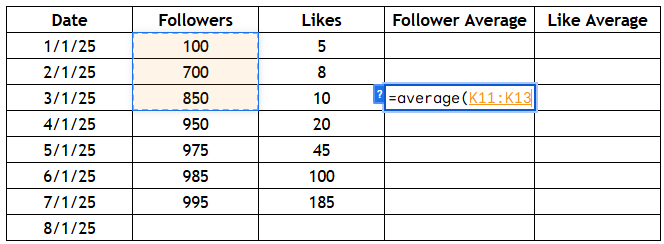
The Rolling Average
The power of a trend chart comes from a rolling aveage. In our example we're doing a 3-month rolling average. Enter the average formula and select the previous three months.
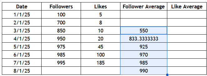
Drag Down The Trend
Once your average is entered, you can drag the dot at the bottom right of the cell down to fill in the average going forward. You have your first set of rolling average trend data!
Complete The Table
Follow the same steps to complete a rolling average for your Likes.
Build Your Chart
Select the entire table that you have created and insert a line chart. This will likely look useless to start until we select and format our information.
Pick The Correct Data
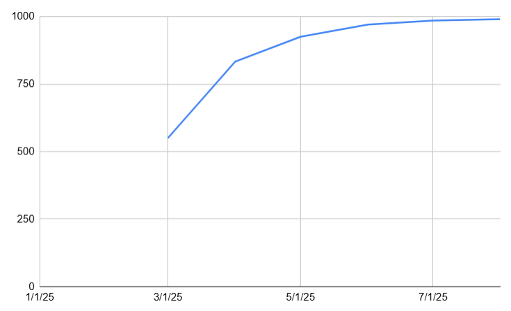
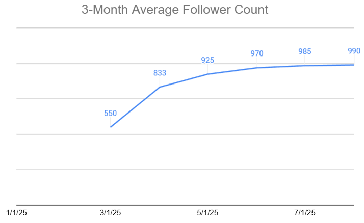
Here is the formatted view of just our Follower Average. The X-Axis is set to use our Date column, and we've removed the Follower, Likes, and Like Average columns from the chart.
Format For Clarity
- We added data labels to our Follower Average
- We removed the Y-Axis as it's not needed with the labels
- We added a title for the chart